#PickaPL8: Iowa redesigns its license plate
This is an exciting time to be a license plate nerd in Iowa!
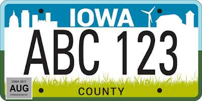
Today at the Iowa State Fair, the Iowa Department of Transportation unveiled three potential designs to replace the current standard issue plate starting in 2018. The designs, and their respective names, are:


The DOT is allowing Iowans to vote for their favorite design, both online and at the DOTs booth at the state fair.
I like license plates so I am very interested in how this will turn out. Since the state has used the current city and country design since 1997, I think a redesign is long overdue. It’s not that the city and country design looks bad. Though it may not be as timeless and symbolic as the plates used by some states—California, Colorado, Minnesota, Oregon, Vermont, and Wisconsin are some that have iconic designs that have stood the test of time—it’s not ugly and has served its purpose well. But it’s old and outdated. I was in eighth grade when it replaced the very basic white on blue design.
(To be fair, the design has been tweaked slightly over the years. You can read about the changes here).
I was very eager to see the DOTs potential designs, and I was very intrigued when I saw them for the first time on Twitter this morning. A little underwhelmed, but intrigued.
Overall, I think the designs are modern, simple, clean, and utilitarian. I don’t dig the use of a sans serif font for the state name—it’s boring and unimaginative—but I can live with it.
My first thought was, “A cop designed them.” It is plain to see that readability for law enforcement and cameras no doubt took precedence in the design process. The state name and serial are very prominent and legible, as I suppose they should be. (That’s what license plates are for, right?)
Here are my thoughts about each design:
• City Country Reboot is too busy for my liking; the top band with the state name is too crowded. It has a very odd border, too, which I first thought was included by mistake. Bobblehead pointed out that the grass at the bottom looks like an overgrown lawn. We might need to call Chuck Grassley to mow it.
• While Flying Our Colors is growing on me, it’s not my cup of tea. It is simple, clean, and uncluttered; I like the eagle in the background, though Bobblehead thinks it looks more like a turkey or peacock. To me, Flying Our Colors looks too much like Missouri’s state flag (though upside down). Looking at it now, it also reminds me of the ribbons at the top of a Medicare card. It is too nationalistic, too.
• Great Wide Open is the design I like most. It is simple, clear, and uncluttered. The artwork featuring different bands of crops and clusters of trees befits Iowa’s countryside, and I don’t mind that the city element has been removed. I also think it complements the motto adorning the state’s welcome signs: Fields of Opportunity. I would gladly put that plate on my car.
Needless to say, I’ve voted for the Great Wide Open plate using my phone and laptop. (It looks like the poll is similar to MLB’s All-Star vote, where one can vote as many times as he or she wants.) Based on the real-time results on the first day, City Country Reboot is ahead. Voting ends on August 20 so we’ll see how it turns out.
Today at the Iowa State Fair, the Iowa Department of Transportation unveiled three potential designs to replace the current standard issue plate starting in 2018. The designs, and their respective names, are:
City Country Reboot

Flying Our Colors

Great Wide Open

The DOT is allowing Iowans to vote for their favorite design, both online and at the DOTs booth at the state fair.
I like license plates so I am very interested in how this will turn out. Since the state has used the current city and country design since 1997, I think a redesign is long overdue. It’s not that the city and country design looks bad. Though it may not be as timeless and symbolic as the plates used by some states—California, Colorado, Minnesota, Oregon, Vermont, and Wisconsin are some that have iconic designs that have stood the test of time—it’s not ugly and has served its purpose well. But it’s old and outdated. I was in eighth grade when it replaced the very basic white on blue design.
(To be fair, the design has been tweaked slightly over the years. You can read about the changes here).
I was very eager to see the DOTs potential designs, and I was very intrigued when I saw them for the first time on Twitter this morning. A little underwhelmed, but intrigued.
Overall, I think the designs are modern, simple, clean, and utilitarian. I don’t dig the use of a sans serif font for the state name—it’s boring and unimaginative—but I can live with it.
My first thought was, “A cop designed them.” It is plain to see that readability for law enforcement and cameras no doubt took precedence in the design process. The state name and serial are very prominent and legible, as I suppose they should be. (That’s what license plates are for, right?)
Here are my thoughts about each design:
• City Country Reboot is too busy for my liking; the top band with the state name is too crowded. It has a very odd border, too, which I first thought was included by mistake. Bobblehead pointed out that the grass at the bottom looks like an overgrown lawn. We might need to call Chuck Grassley to mow it.
• While Flying Our Colors is growing on me, it’s not my cup of tea. It is simple, clean, and uncluttered; I like the eagle in the background, though Bobblehead thinks it looks more like a turkey or peacock. To me, Flying Our Colors looks too much like Missouri’s state flag (though upside down). Looking at it now, it also reminds me of the ribbons at the top of a Medicare card. It is too nationalistic, too.
• Great Wide Open is the design I like most. It is simple, clear, and uncluttered. The artwork featuring different bands of crops and clusters of trees befits Iowa’s countryside, and I don’t mind that the city element has been removed. I also think it complements the motto adorning the state’s welcome signs: Fields of Opportunity. I would gladly put that plate on my car.
Needless to say, I’ve voted for the Great Wide Open plate using my phone and laptop. (It looks like the poll is similar to MLB’s All-Star vote, where one can vote as many times as he or she wants.) Based on the real-time results on the first day, City Country Reboot is ahead. Voting ends on August 20 so we’ll see how it turns out.

